A social platform that brings the right people together.
Product design for Palify — a social platform where communities, conversations, and genuine connections live in one calm place. I owned the web experience end-to-end, from information architecture to a shipped design system. A companion mobile app extends the same language.
- Role
- Product Designer — sole designer
- Timeline
- 2023 — 2024
- Team
- 1 PM · 4 engineers
- Platform
- Web app + mobile
- Scope
- Research → UX → UI → Design system
- Tools
- Figma · FigJam
Overview
Palify is a social platform built from zero — a place to find your communities, follow conversations that matter, and actually connect rather than doomscroll. I came on as the sole designer and shaped the product from the first whiteboard sketch to a production-ready system.
Most social products optimise for time-on-app at any cost. The brief here was different: design for signal over noise, make communities easy to find and easy to leave, and keep the interface calm enough that people come back because they want to — not because they're hooked.
The problem — social that felt hollow.
People don't lack social apps — they lack ones that feel good to use. Feeds reward outrage, communities are hard to discover, and the loudest voice always wins.
Palify needed to feel human from the first screen. For every familiar social-app failure, the design answered with a deliberate, calmer pattern.
Feeds that reward noise and leave you feeling worse.
A signal-first feed that surfaces people and topics you chose.
Communities are buried and hard to discover.
A discovery surface that matches you to communities by interest.
Onboarding asks for everything before showing any value.
Progressive onboarding — value first, profile depth later.
Conversations get dominated by the loudest accounts.
Thread design that elevates relevant replies, not just popular ones.
No clear, low-friction way to leave or mute a space.
Calm controls: mute, snooze, and leave are always one tap away.
Design goals
Make finding your people feel effortless, not algorithmic.
Design a feed that respects attention instead of farming it.
Ship one system that works across web and mobile.
Keep moderation and safety built-in, not bolted on.
Launch a 0→1 product the team could grow on for years.
Process — zero to launch.
Three phases, one designer, end to end. A 0→1 product means getting the foundations right before the polish — so the work started with people and architecture, not pixels.
The full design journey — drag the canvas to explore it like a map.
- Discover · 01
Research & interviews
Talked to people about why they leave social apps, mapped the jobs they actually hire a community for, and turned it into clear design principles.
- Discover · 02
Information architecture
Structured the product into a clean spine — feed, communities, profiles, and messaging — so the app stays learnable as it grows.
- Design · 03
Flows & wireframes
Pressure-tested onboarding, posting, and community discovery in low fidelity before committing to a visual direction.
- Design · 04
Feed & interaction patterns
Designed the core loops — read, react, reply, join — to feel quick and calm, with motion that guides rather than distracts.
- Design · 05
Visual design & system
Built a friendly, accessible UI and codified it into a design system shared across web and the mobile app.
- Deliver · 06
Prototype, test & handoff
Validated flows with real users, tuned the rough edges, and partnered closely with engineering through launch.
Inside the product
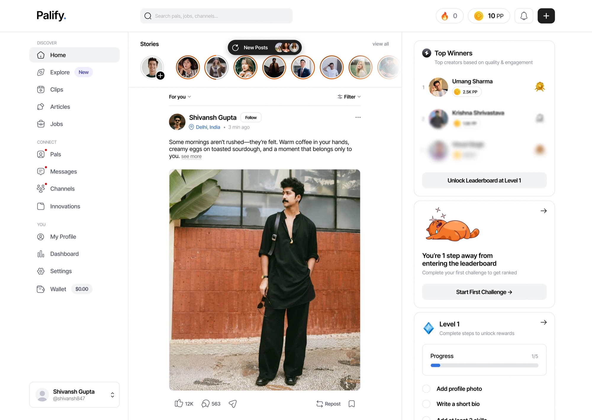
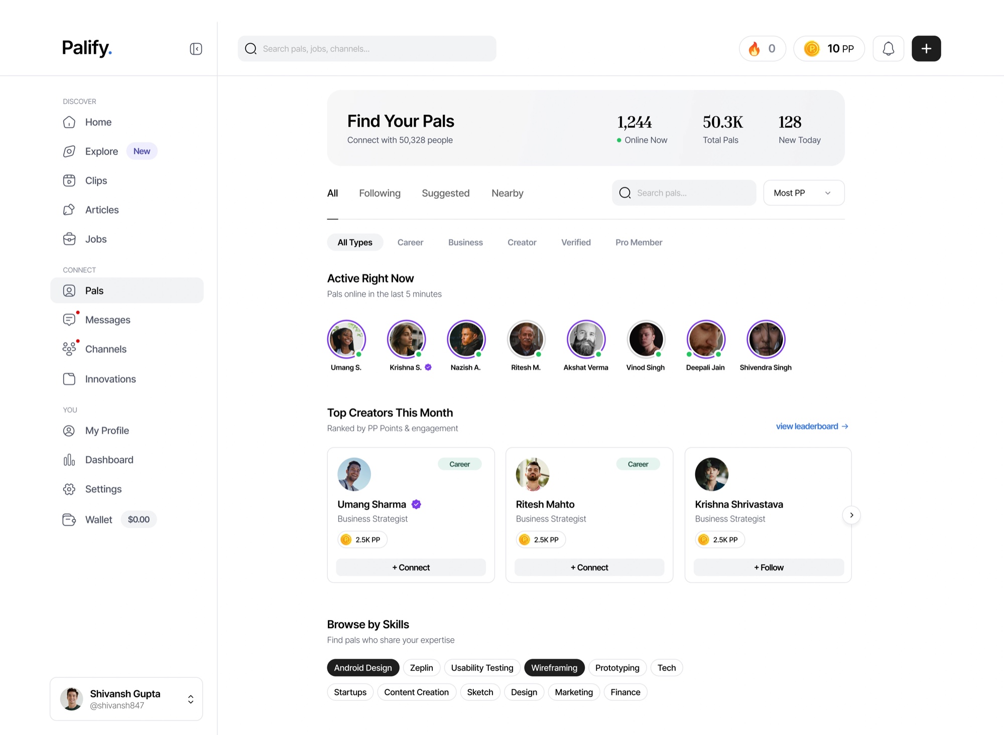
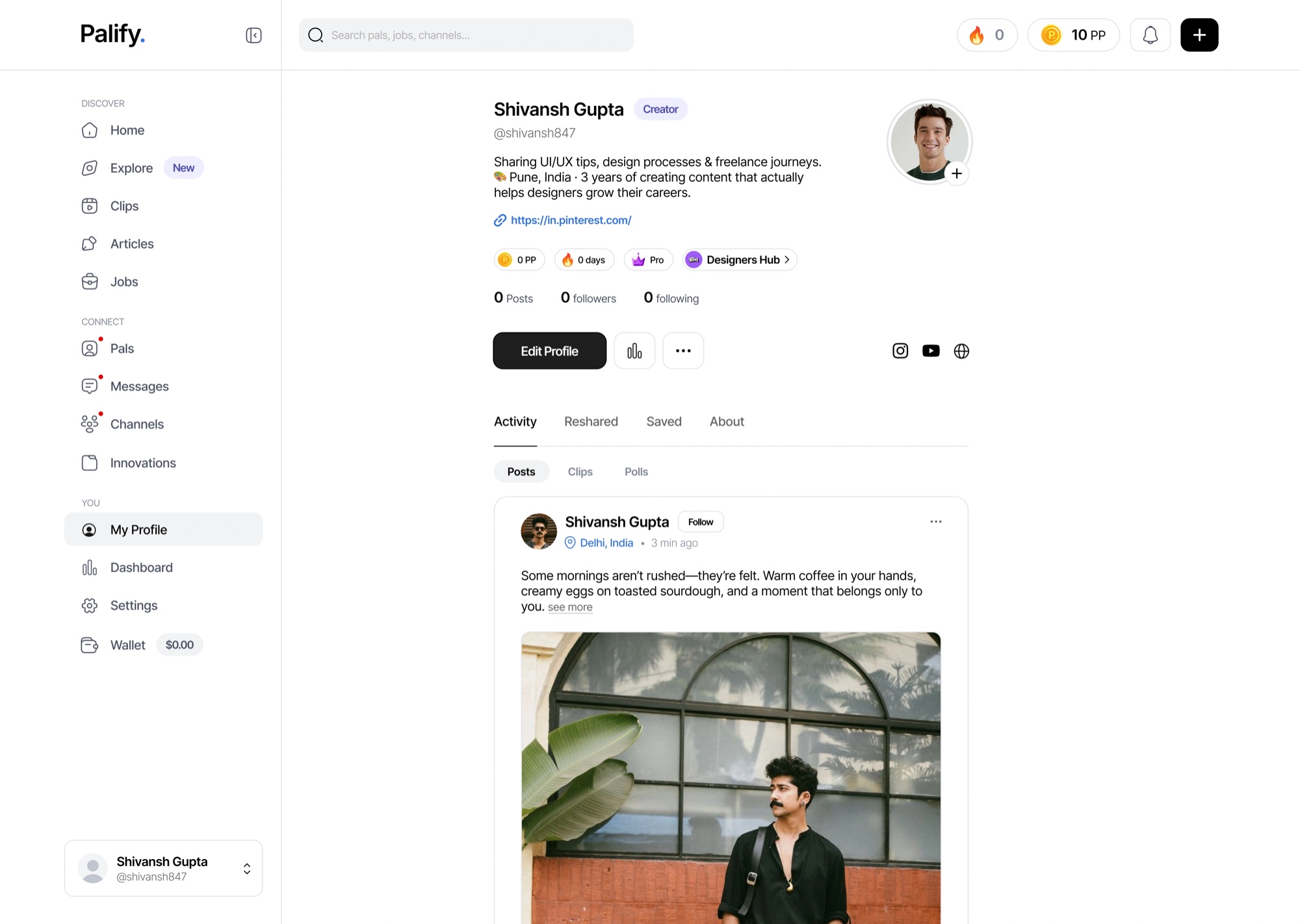
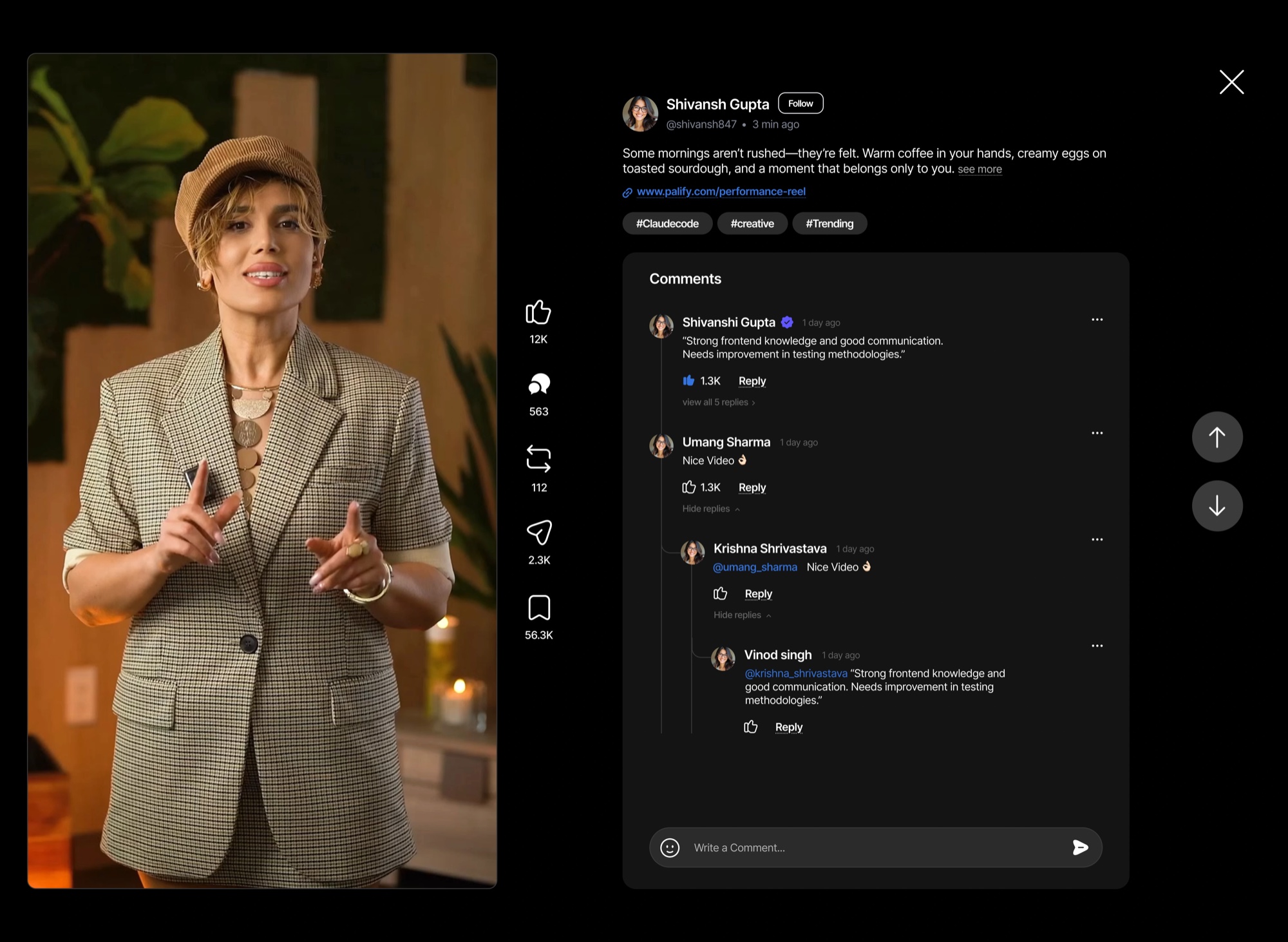
The experience hangs on a few core surfaces — each designed to favour connection over compulsion.
Signal-first feed
A feed built from the people and communities you actually chose, not what an algorithm decides will keep you hooked.
Community discovery
Find and join communities by interest, with previews so you know what you're walking into.
Profiles with substance
Profiles that show what someone's into and contributes — not just a follower count.
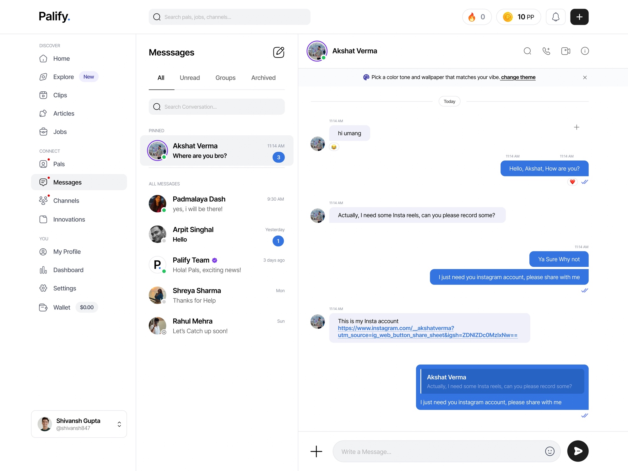
Threaded conversations
Replies that stay readable at scale, surfacing the most relevant voices in a thread.
Direct & group messaging
Lightweight messaging that keeps conversations flowing without leaving the app.
Calm controls
Mute, snooze, and leave any space in a tap — attention stays yours.
Key screens
A look at the core surfaces — the feed, finding your pals, profiles, clips, and messaging.
Design system
One system spans web and mobile — a friendly, high-contrast palette with a single confident green for action, tuned for long, comfortable sessions.
AaBbCcDdEeFfGgHhIiJjKkLlMmNnOoPpQqRrSsTtUuVvWwXxYyZz 0123456789 & @ # % ( ) ! ?
Brand & accent
Surface & borders
Text
Gradients
Signal over noise
Every surface favours the content you chose over the content that performs.
Calm by default
Quiet color, gentle motion, and controls that hand attention back to the user.
One language, two platforms
Web and mobile share tokens and components, so the product feels like one thing.
Safe to be in
Moderation, muting, and reporting are designed in from the first screen.
Outcome & impact.
Palify launched as a calm, coherent social product with a clear point of view — communities you choose, conversations worth having, and an interface that respects your time.
The shared design system made the web and mobile apps feel like one product and gave the team a foundation to ship new surfaces fast.